Stryker Neurovascular
Stryker's brand guidelines leave almost nowhere to hide. Nearly all assets must sit on white. No more than one-third of any composition can carry color. No dark backgrounds, no gradients, no visual noise.
That's manageable for a one-off deliverable. This wasn't a one-off. It was years of work across six channels, for national and global sales meetings with the same restrictions every single time. Each year needed to feel new. The toolkit never changed.
Date
2017-2021
Client
Stryker Neurovascular
Role
Creative Producer
Production
Riverview Systems Group, Inc.
Scope
Stage Design
Staging Graphics
Art Direction
GREY
White
Gold
Black
Challenge
Refresh a minimalistic event brand for a global audience across all event channels.
✓ Adhere to brand guidelines and regluatory compliance
✓ Establish an updated look that is unique from the last event and remains recognizably Stryker.
✓ Consider Global Partners when scaling to accomodate trasnlation or regional tag lines.
Constraint as a creative framework.
The work leaned into constraint as a creative framework where whitespace became structural and the one-third color allocation became a tool to guide the eye within compensation.
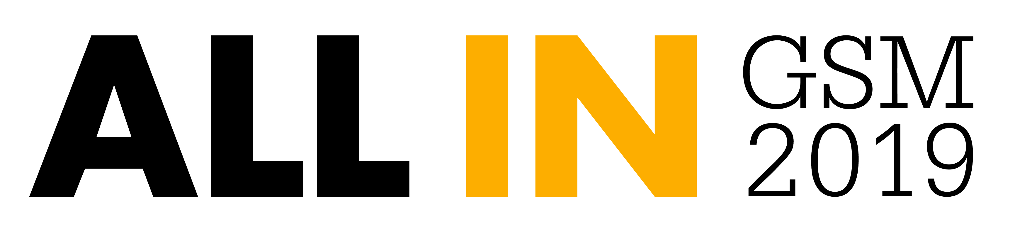
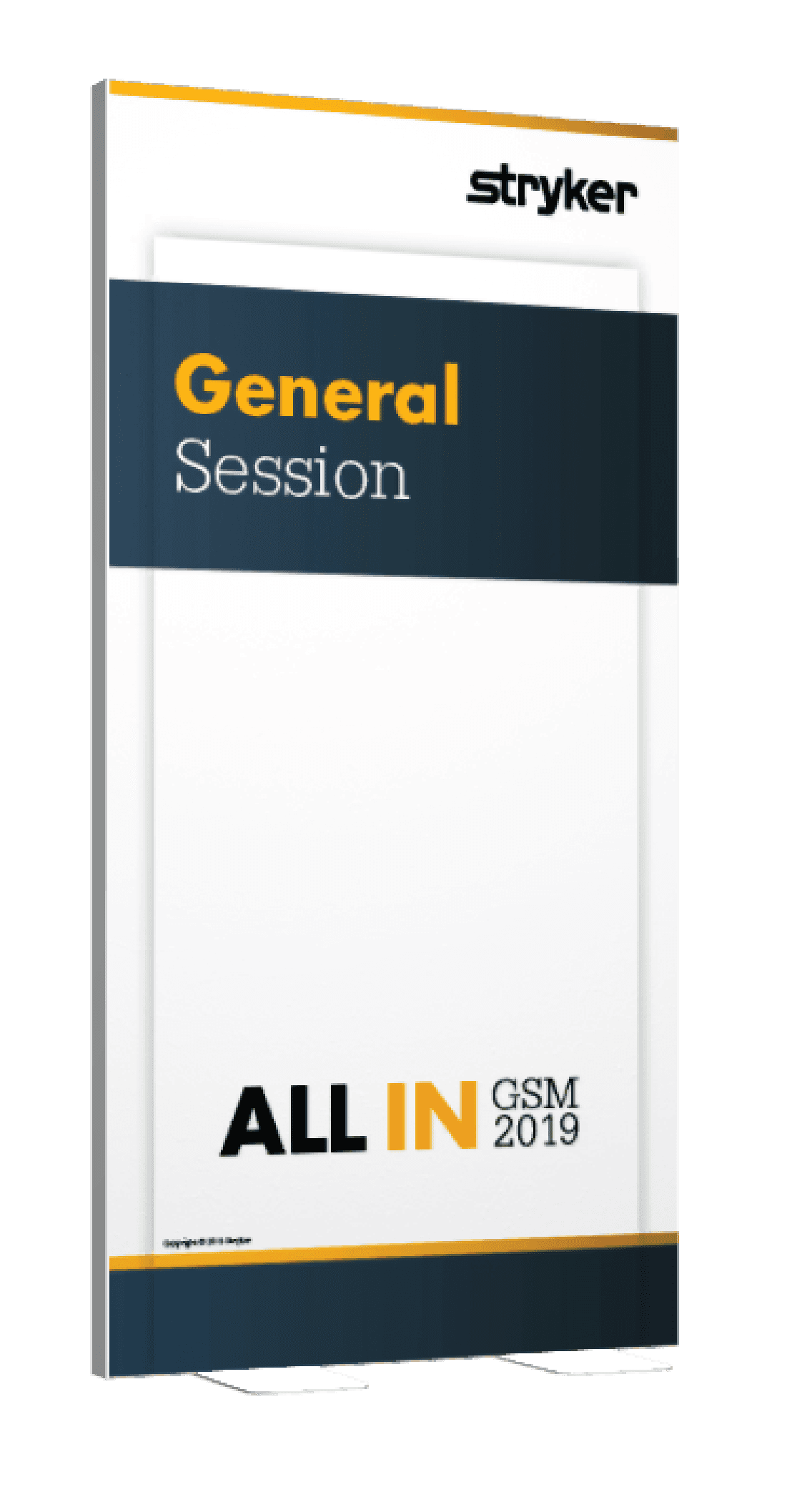
Brand Development
Annual event identities with word marks, branding kits, and type treatments each needed to feel distinct from the year before. With simplification and clever use of composition, type, and color they were unique but still brand compliant.

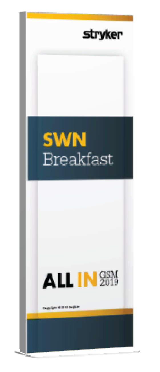
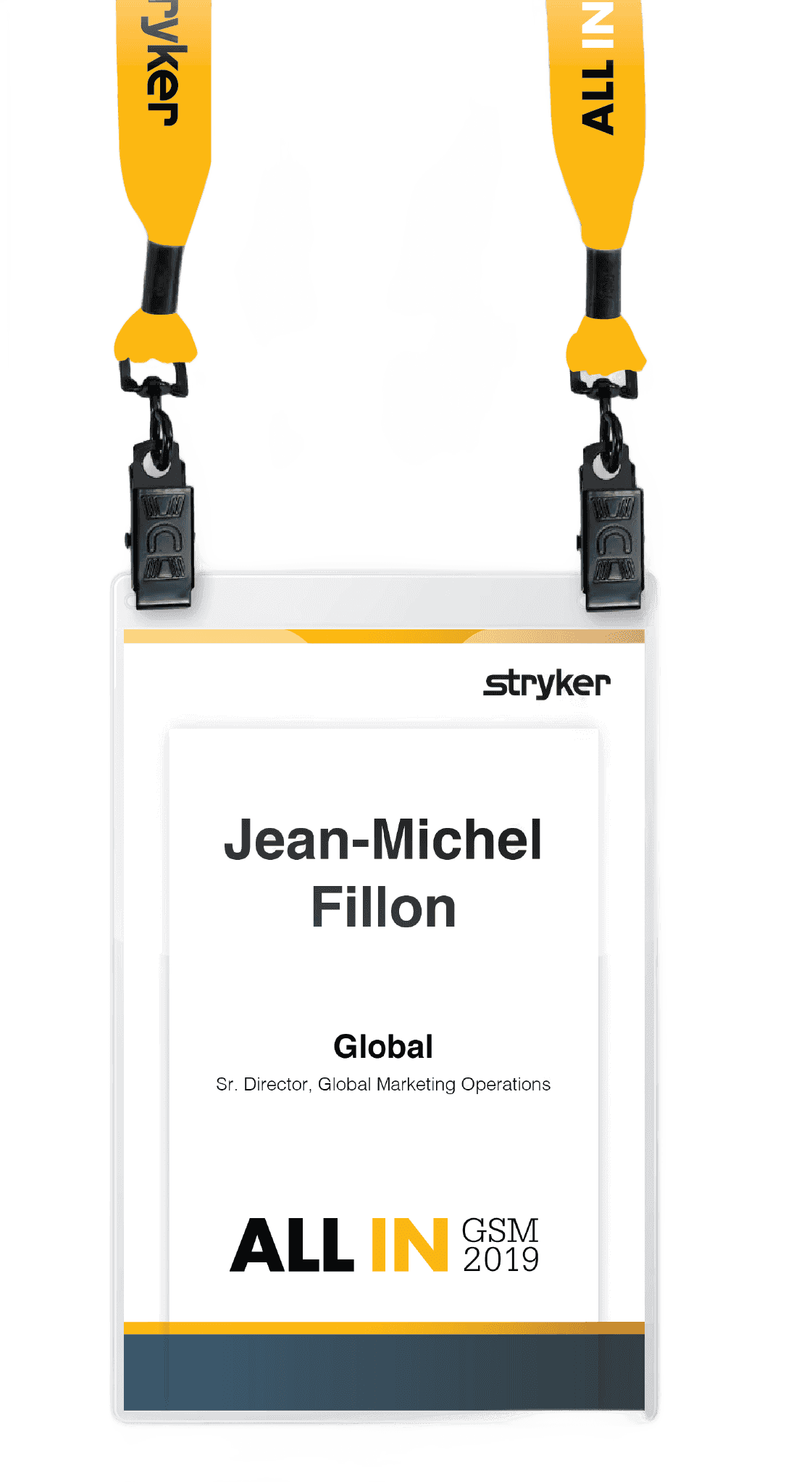
Marketing & Environmental
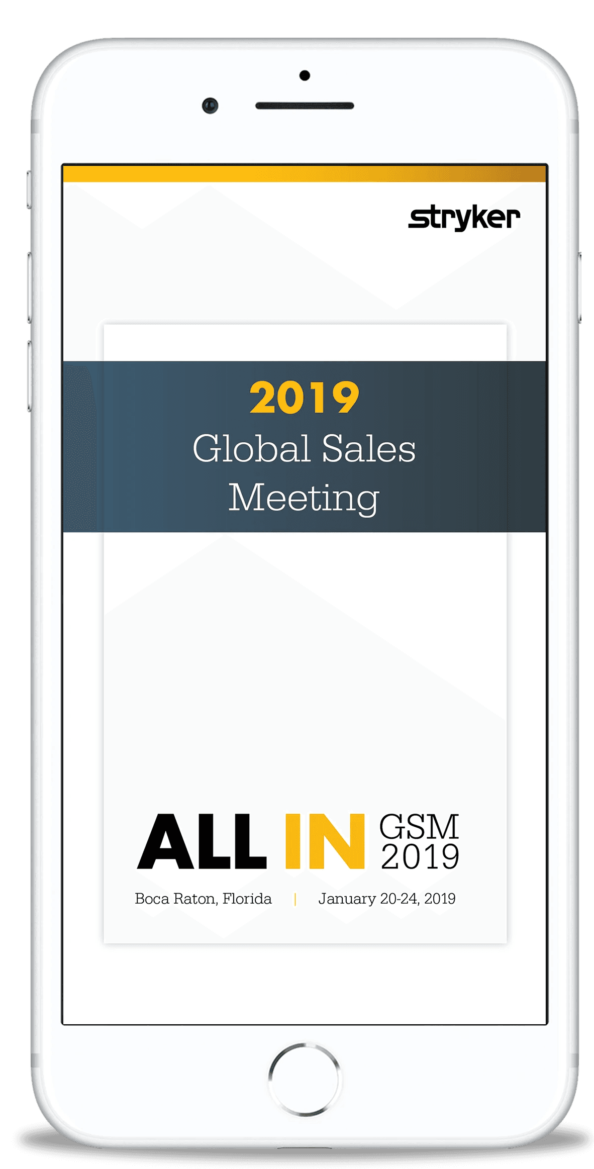
Environmental graphics and wayfinding turned convention spaces into something recognizably Stryker while extending the event identity to exhibition booths, web banners, mobile screens, print collateral, and merchandise.

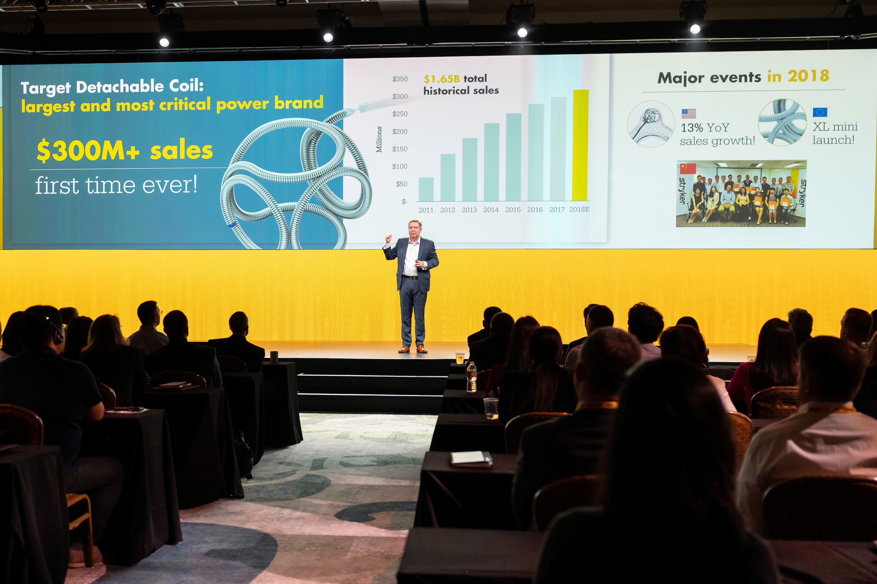
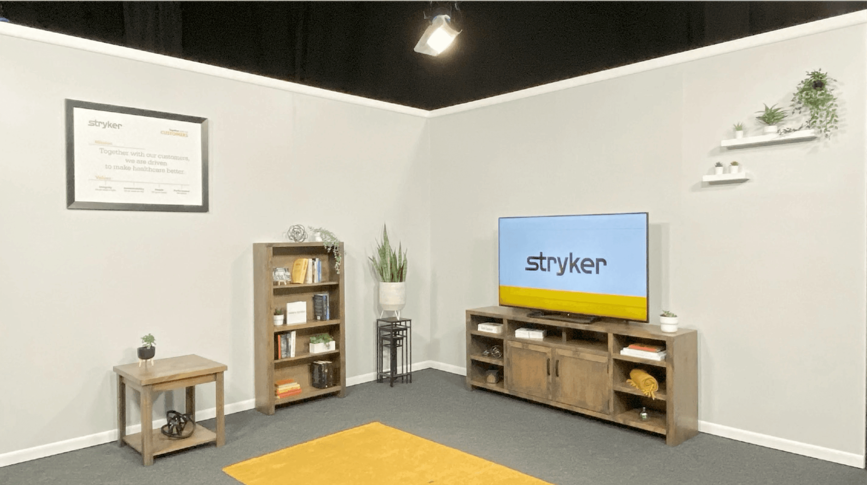
Staging
Each stage needed to feel immersive in person and photograph cleanly against the white-dominant system. Video, lighting, and scenic read as bold without exceeding the one-third color rule.


Motion Graphics
Animated logos, lower thirds, speaker identifiers, theme loops, and live performance visuals. Motion carried the energy that static compositions couldn't — room holds between sessions, LED panel takeovers for brand activations, and opening sequences that set the tone before a presenter took the stage.
Video Production
Presentation reels and executive interview content where editorial pacing and narrative structure carried the storytelling. The visual system doesn't allow you to overpower with imagery, so the edit had to be precise.
Virtual & Hybrid
When events shifted remote, translated the physical brand presence into 3D-modeled broadcast environments, web interfaces, and studio set designs that maintained the same disciplined aesthetic on screen.
Event Interface


Remote Keynote Presenters

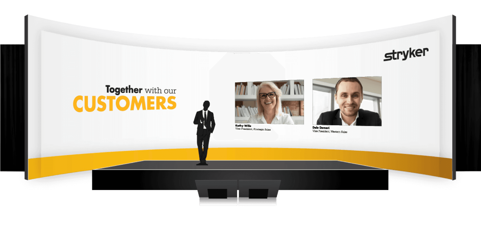
Broadcast Styling

Studio & Set Design

Results
Breadth without Drift
Delivered across six distinct channels over multiple years without a single off-brand deliverable — proving that creative range and brand compliance aren't at odds.
Distinction within sameness. Each annual event carried its own visual identity, recognizable as new, while reinforcing a consistent brand experience that compounded over time.
Constraint as craft. The restrictive guidelines forced a level of compositional and typographic precision that became the work's signature. Spatial relationships, hierarchy, and the strategic use of limited color did the work that most brands delegate to visual volume.
Cross-disciplinary execution. Bridged the gap between brand, staging, video, motion, and environmental design — workshopping and iterating across disciplines so every element worked as a system, not a collection of assets.
Seamless format transition. Successfully moved a physical brand experience into virtual and hybrid formats during the shift to remote events, without compromising the visual standard.