Puppet Conference
A developer-focused conference with visual identity as sharp as its audience. The stage design leans into Puppet's brand—clean lines, bold orange accents, and typography that reads as technical and approachable.
The environment balances presentation-ready functionality with moments of visual interest, creating a backdrop that enhances rather than competes with content. Staging graphics maintain clarity at scale while reinforcing the systematic, automation-forward ethos that defines Puppet's community.
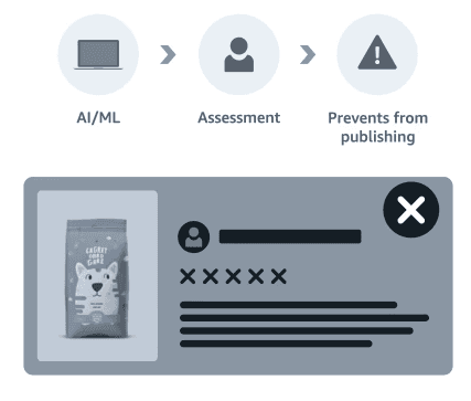
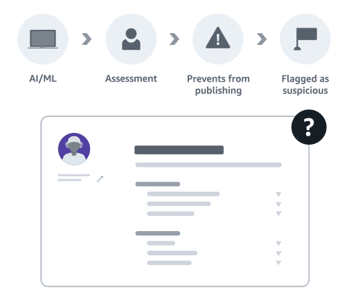
Amazon needed to communicate complex technical investments like machine learning, fraud detection, and robotics automation, to a global audience spanning technical engineers and non-technical business stakeholders. The stakes were high: regulatory scrutiny on AI systems, operational security sensitivities, and the need to demonstrate technical credibility without triggering "surveillance anxiety" or "automation fear."
Traditional internal communications focused on culture and motivation. This required technical accuracy: explaining LLM-based document verification and behavioral pattern detection to audiences who needed to trust the system but lacked CS degrees.
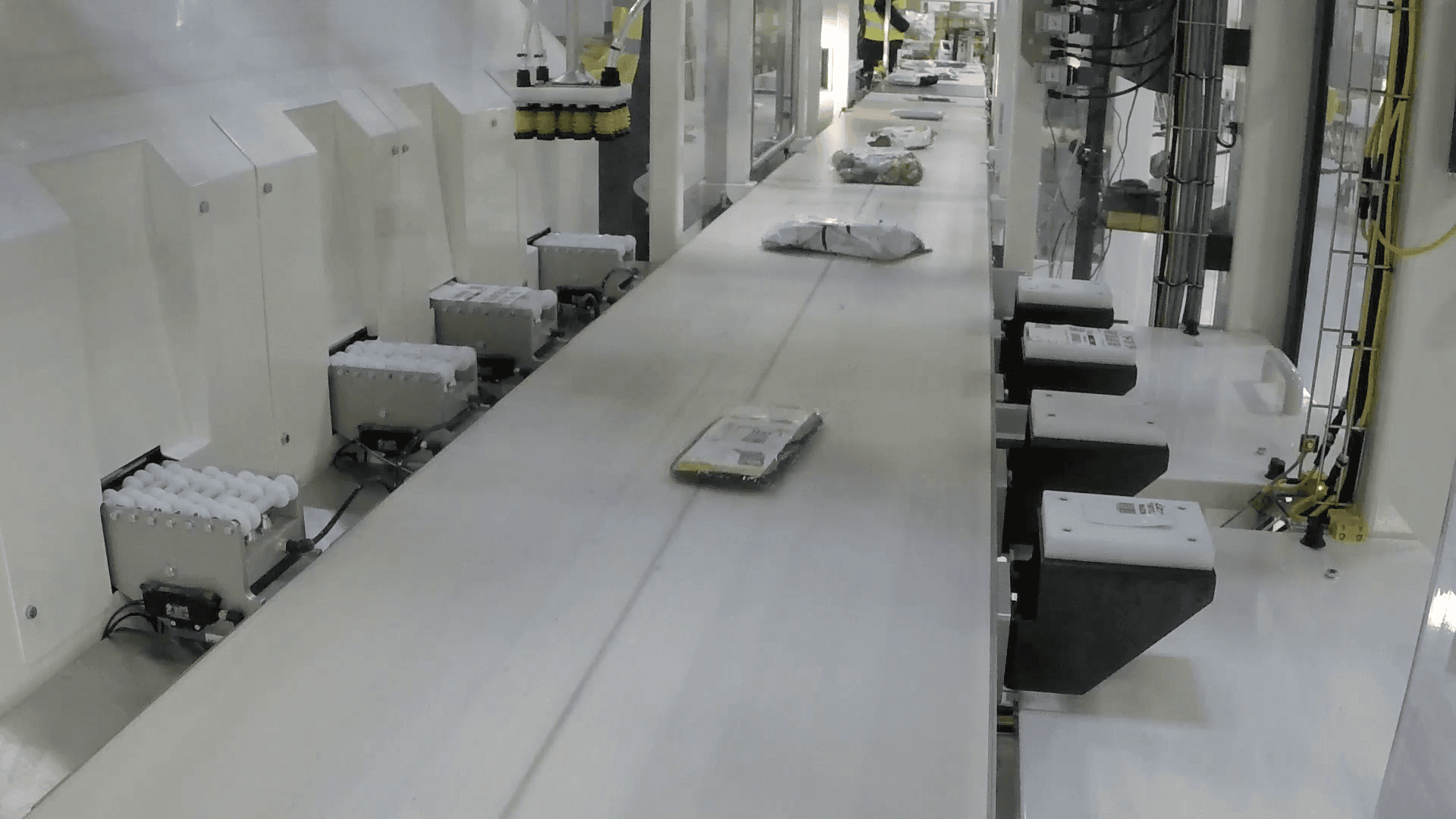
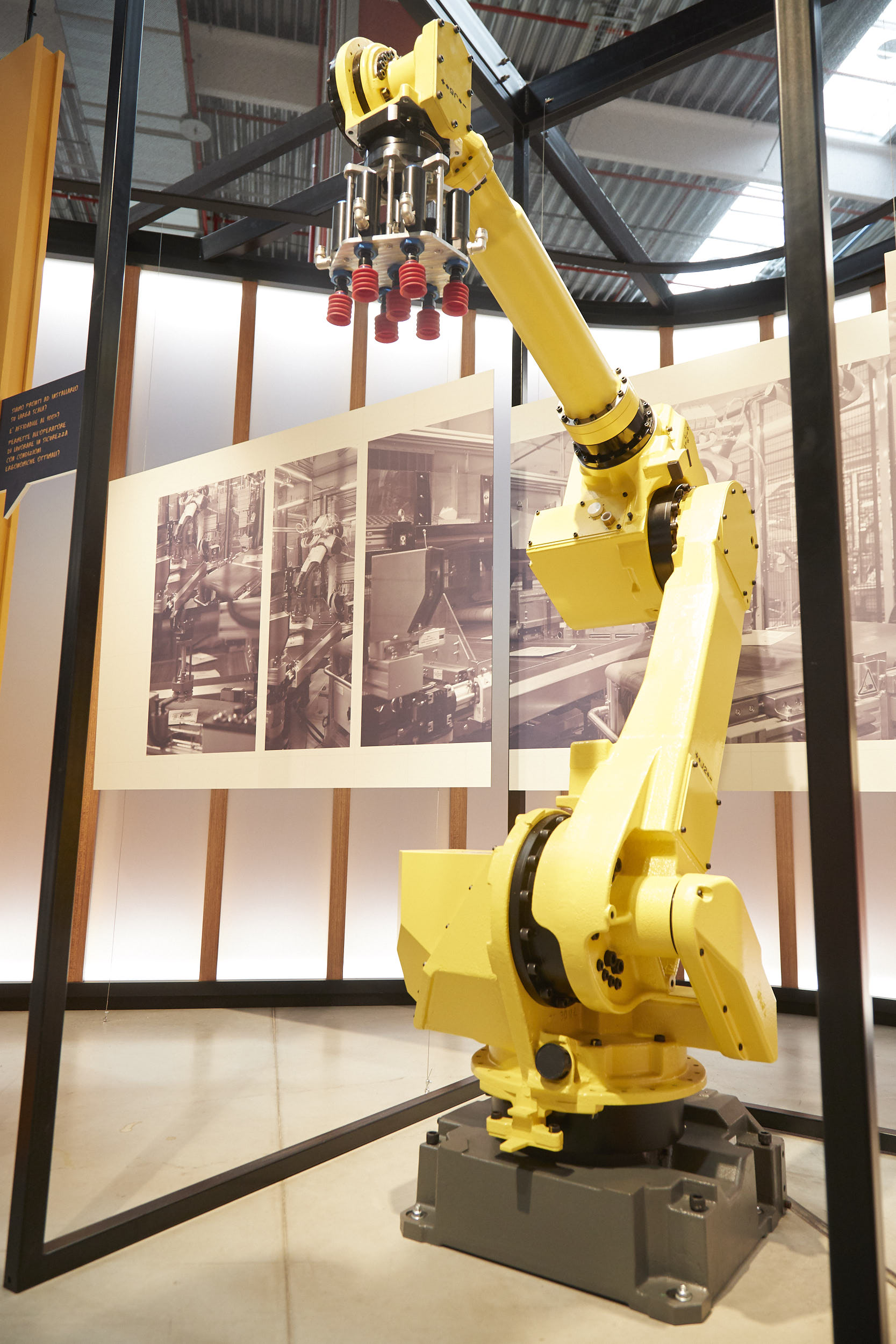
Physical AI & Robotics (10 minutes)
Stefano La Rovere, Director, Global Robotics
1,000+ robotics innovations including the Universal Robotic Labeler—algorithmic optimization reducing packaging waste
Role
Art Director
Client
Puppet
Date
Production
Riverview Systems Group, Inc.
Scope
Visuals stayed clear and readable throughout the program
Brand positioning came through without overpowering content
Design supported speakers and reinforced a systematic, automation-forward ethos
Presentation-ready backgrounds with clear hierarchy
Repeatable visual system that balanced function and personality
Art direction guardrails that kept the program consistent
Brand-aligned typography and orange accents used with restraint
Reinforce brand positioning without generic “corporate” styling
Maintain strong hierarchy for presentation content
Add interest without distracting from speakers